Medical Price Transparency

Context
A new law required healthcare providers and insurers to publish their prices for procedures. As the sole designer on this initiative, I led the effort to translate this mandate into tools that helped patients make informed financial decisions — and guided an unprepared industry toward patient-centric solutions.

Price transparency
In 2020, the Transparency in Coverage bill was passed, requiring health plans to publish their negotiated rates for all medical services. Nobody in the industry was ready for it.

Provider Directory
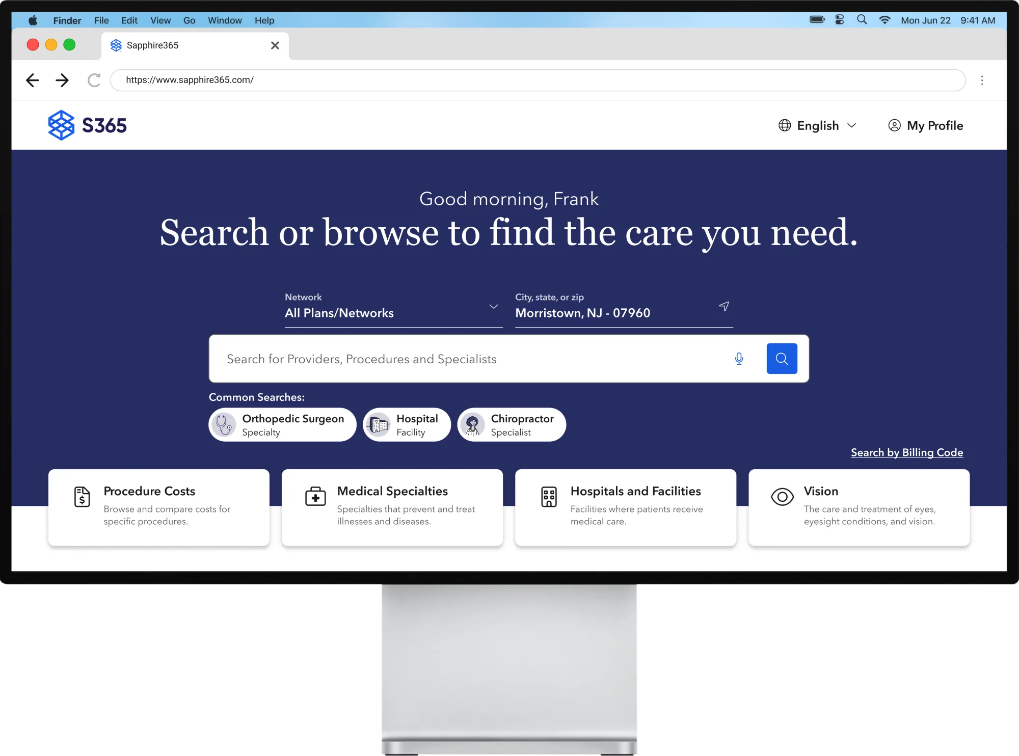
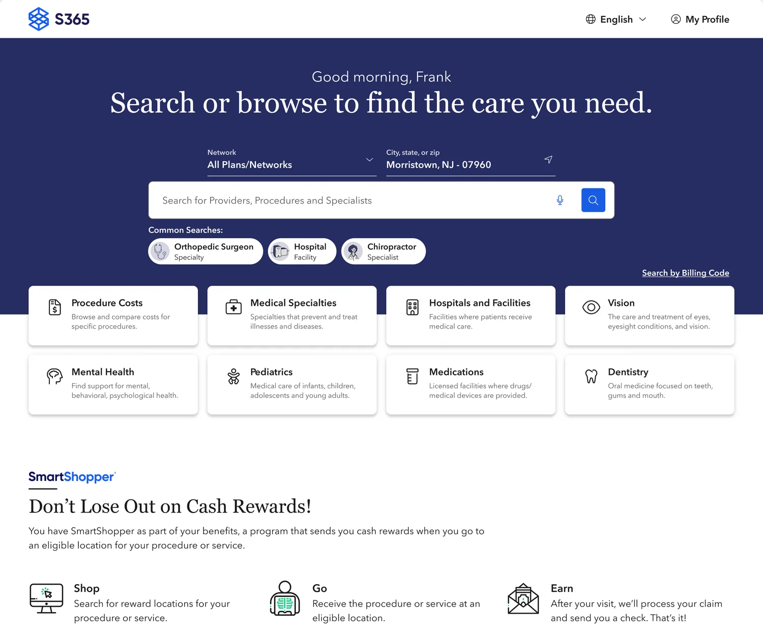
Sapphire365 is a procedure and provider directory, white-labeled for health insurance sites to help members find in-network care. This is where I started.
health plan clients
annual users
annual searches
Procedure Cost
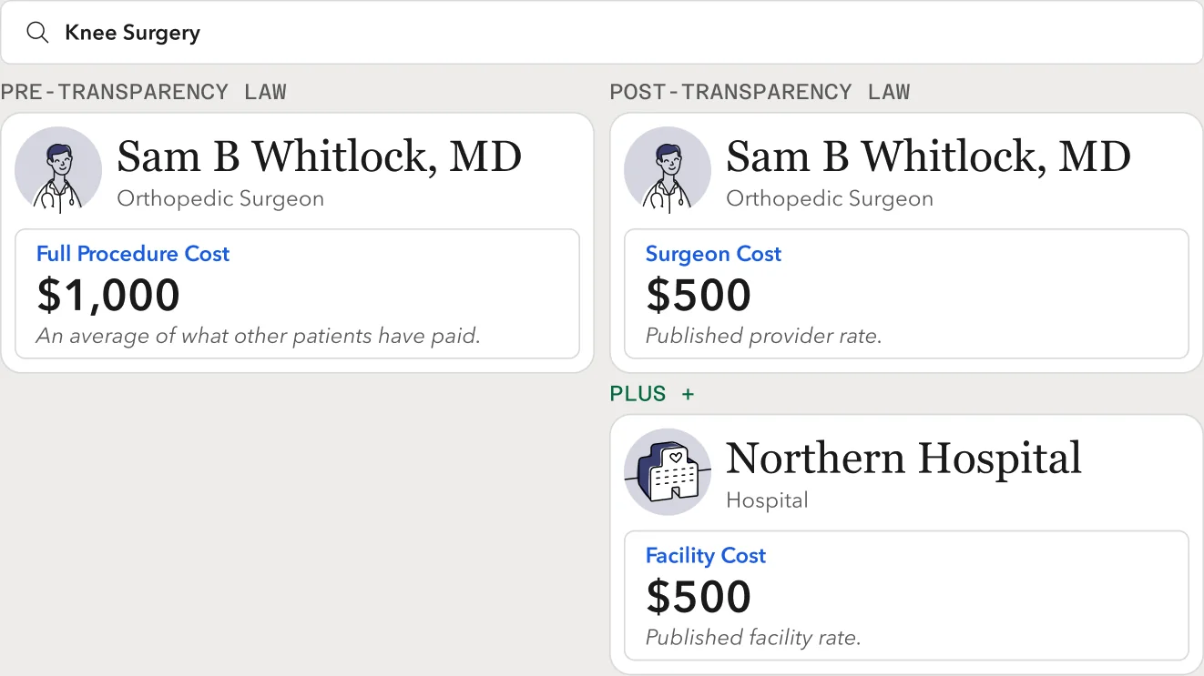
Until this point, cost estimates were based on averaged patient claims — a zoomed-out estimate of a full procedure cost at best.
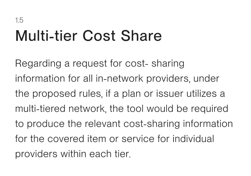
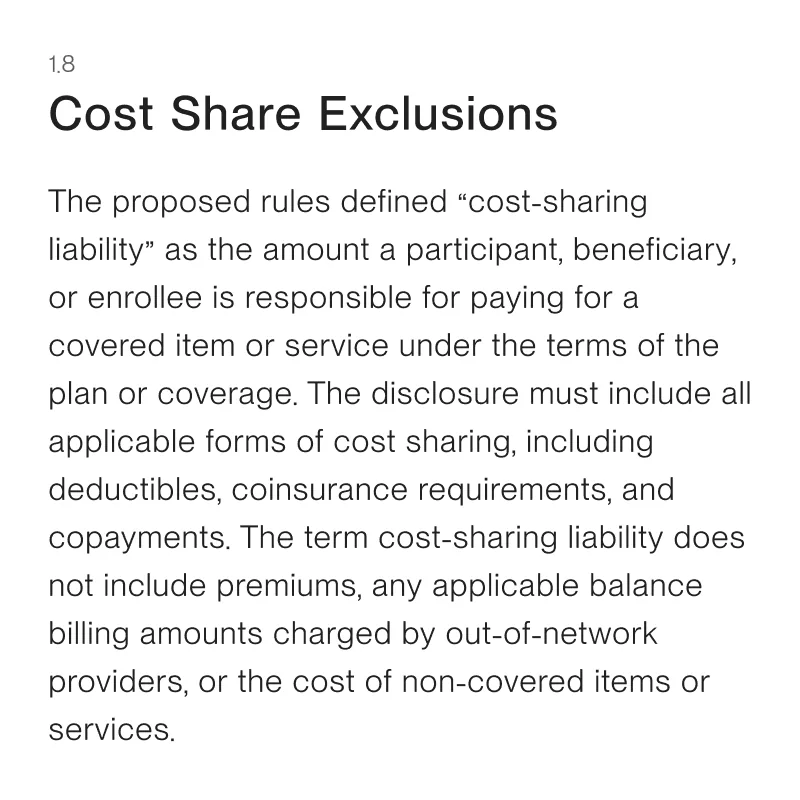
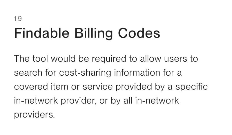
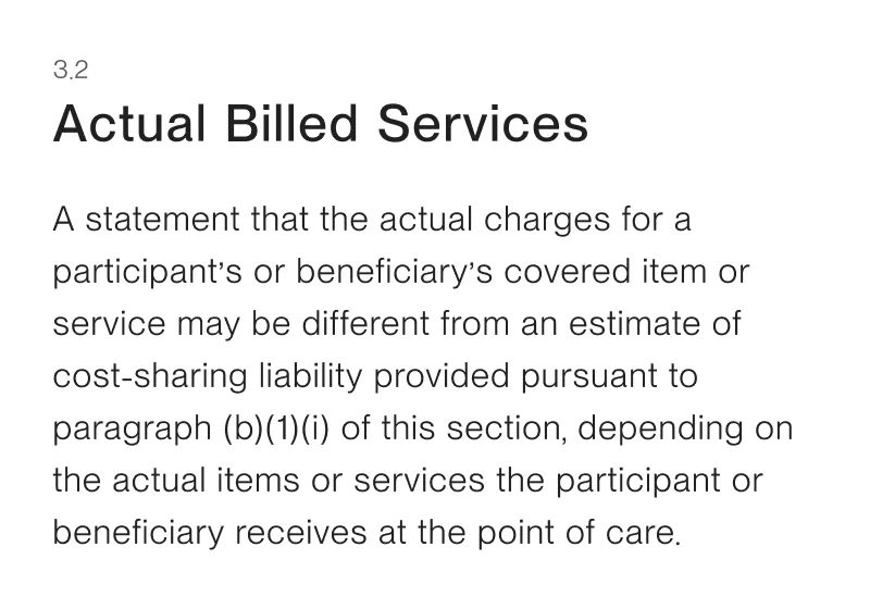
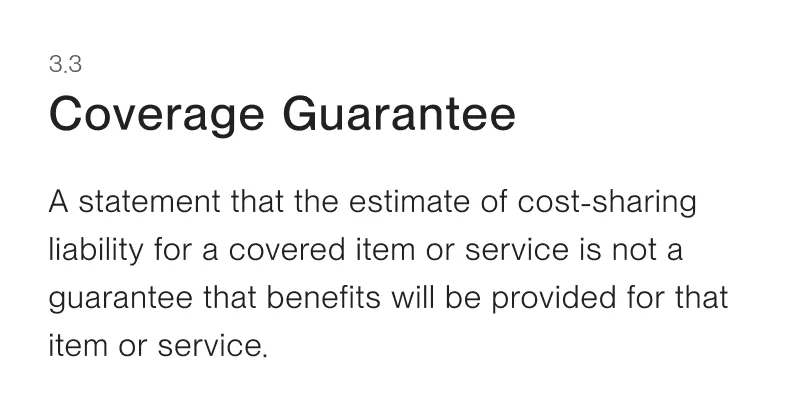
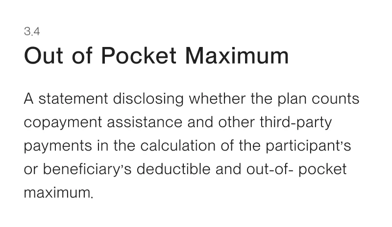
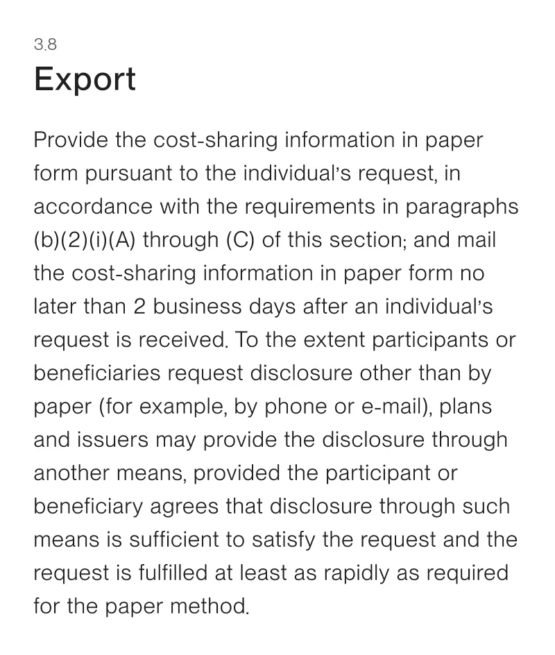
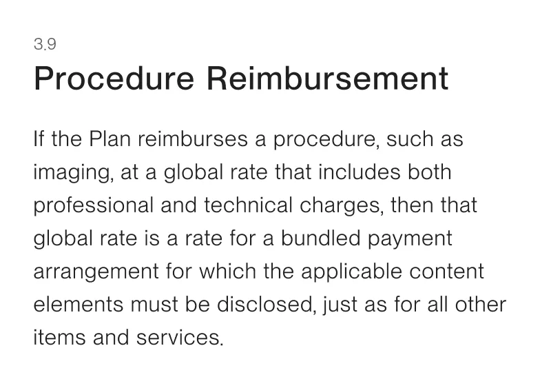
The new data changed that. Individual billed services for a specific procedure are now viewable. These service-level costs are what the mandate requires to be published and searchable, not the full procedure cost.
Unpacking the bill
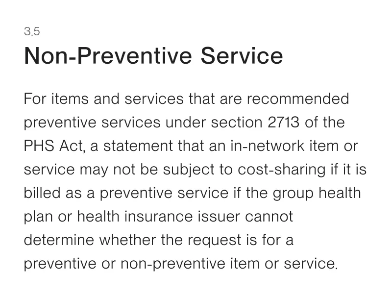
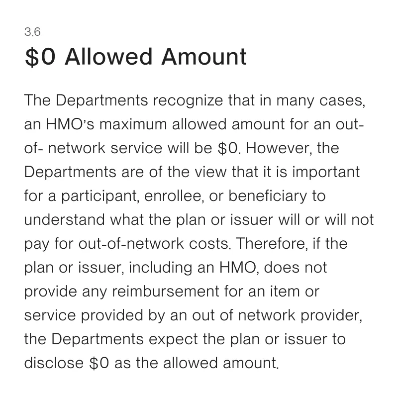
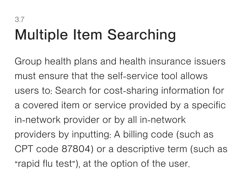
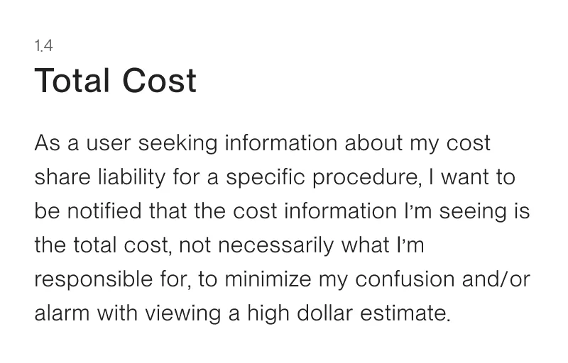
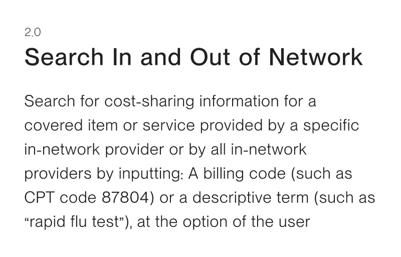
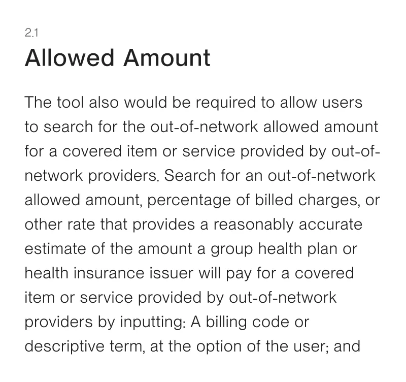
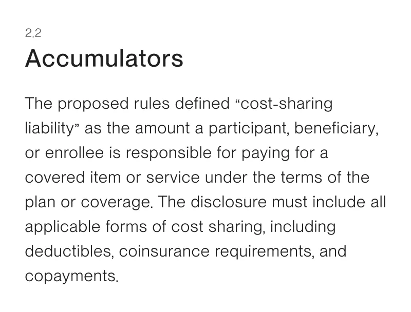
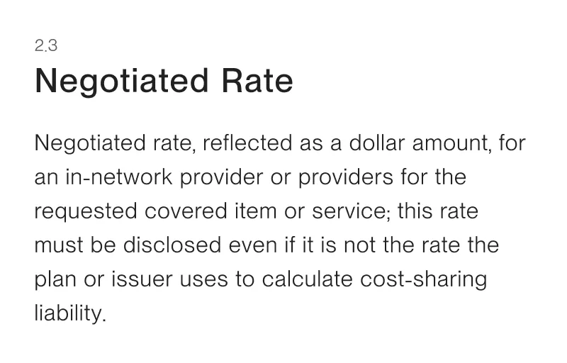
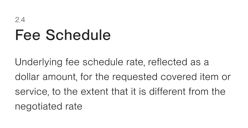
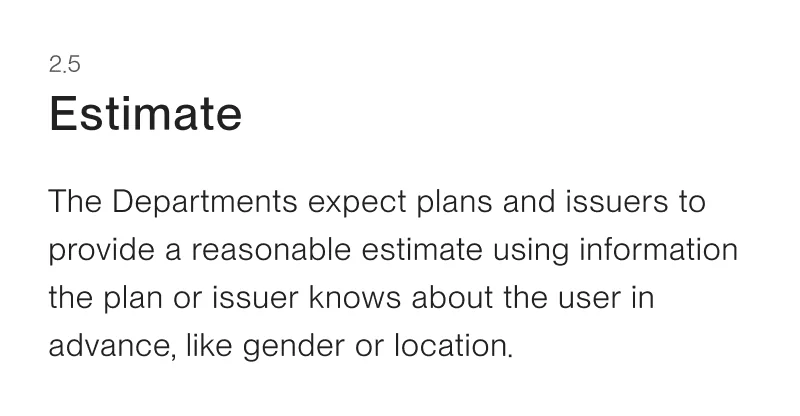
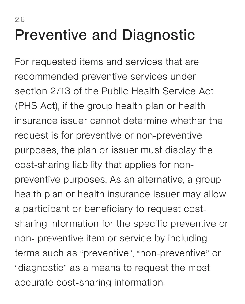
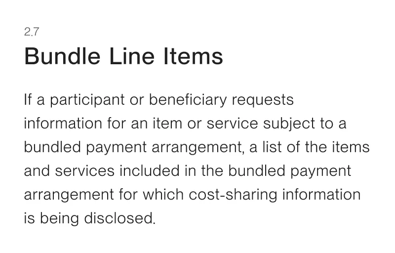
I led the cross-functional effort to decode the bill — working with clients, legal teams, engineers, and government officials to translate regulatory requirements into a two-year product roadmap aimed at a compliant and usable solution.
This included co-informed product requirements and data infrastructure/augmentation strategy.
Healthcare Literacy
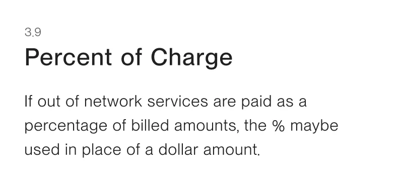
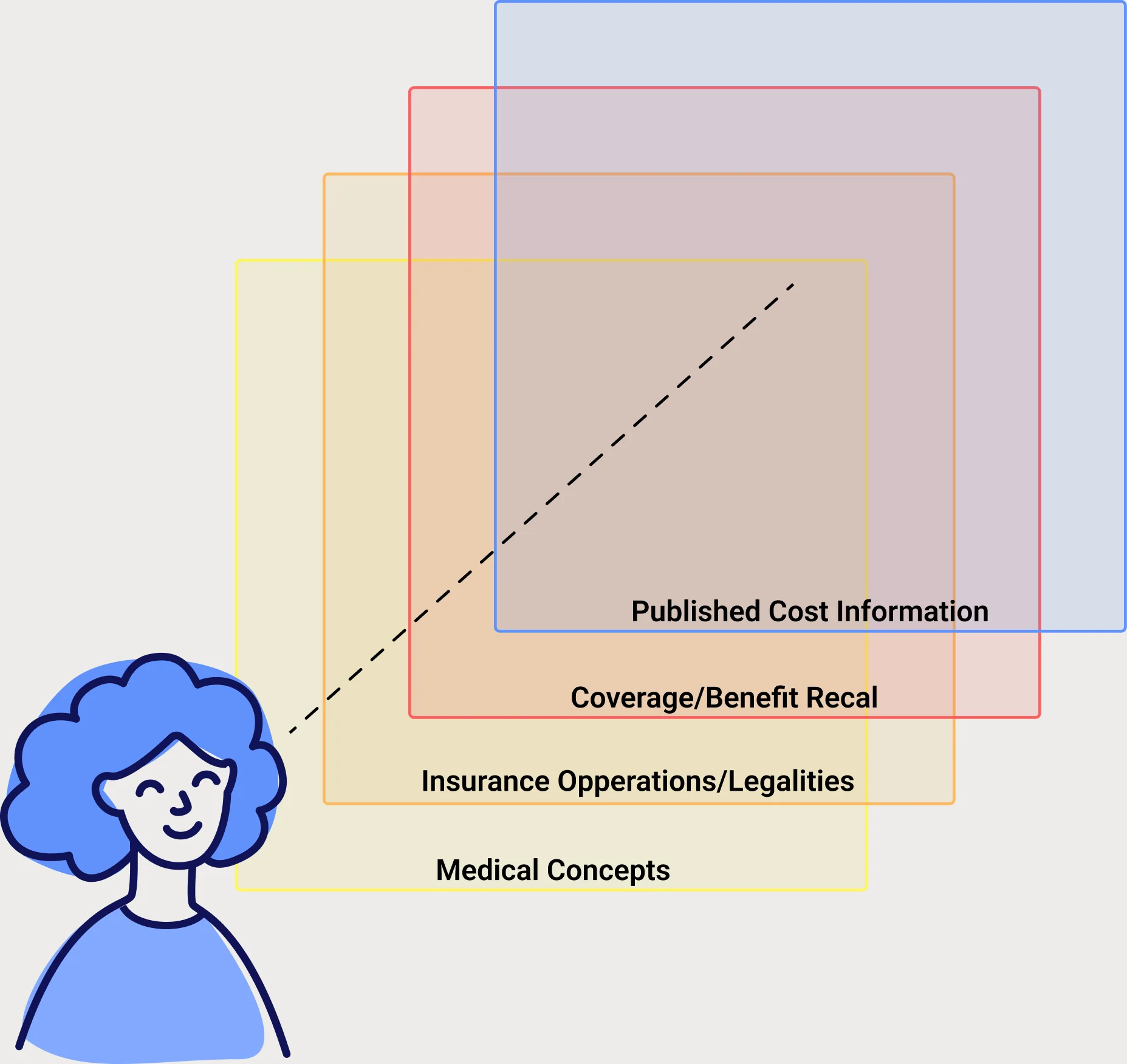
After running over 50 behavioral interviews, the fundamental insight was clear: the barrier to understanding healthcare costs isn't access to information — it's comprehension. To help users understand procedure costs, I needed to deliver the right context at the right moment in their journey.
Solution Strategy
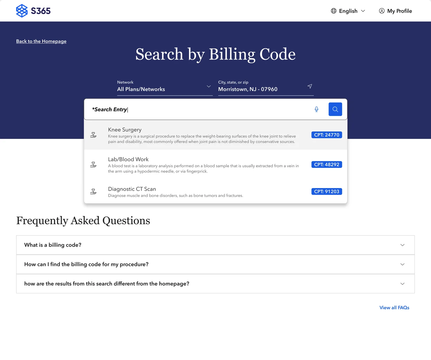
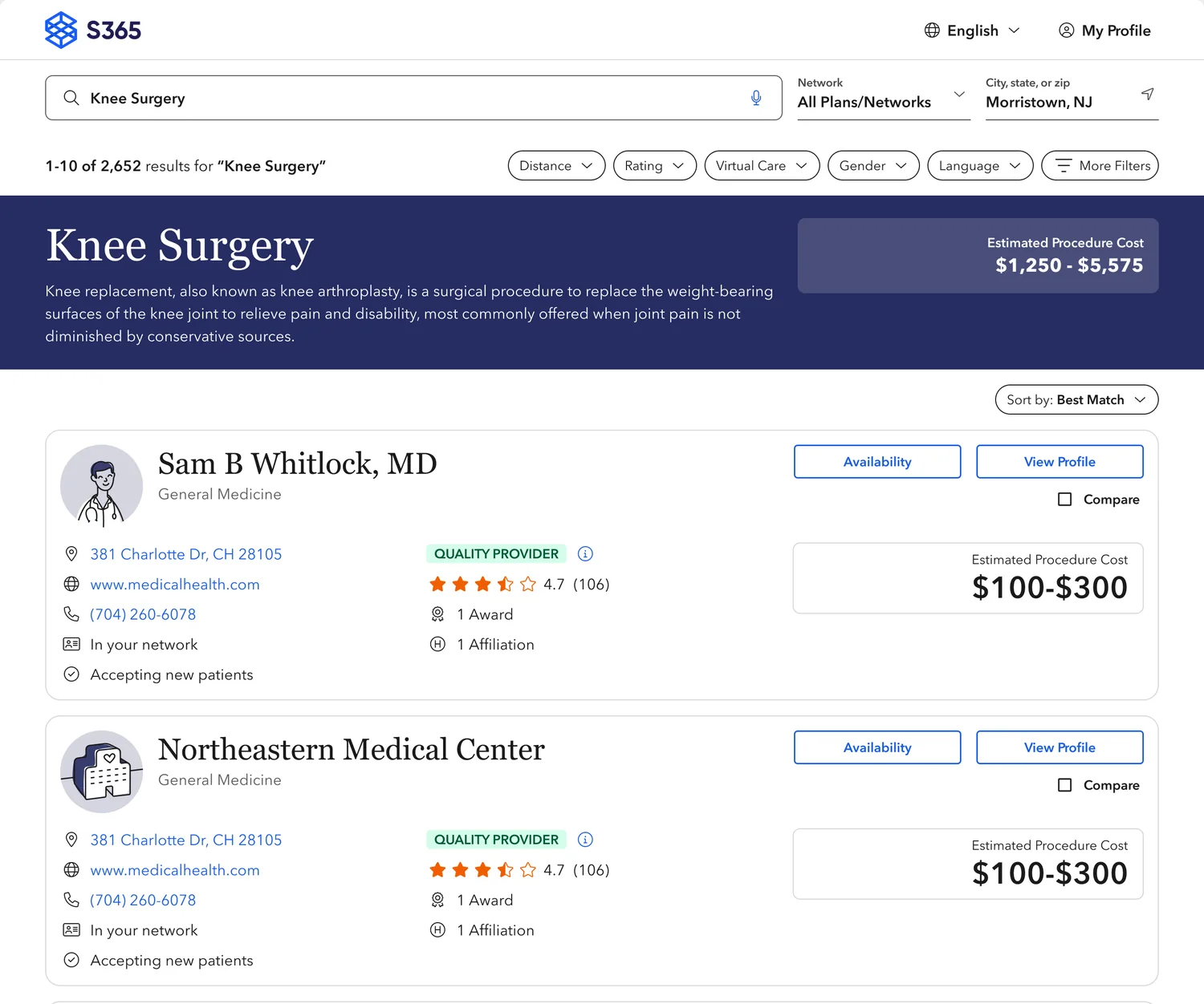
I mapped user insights to the care journey to identify high-impact solution spaces and filter out legislative elements that wouldn't add value to patients.
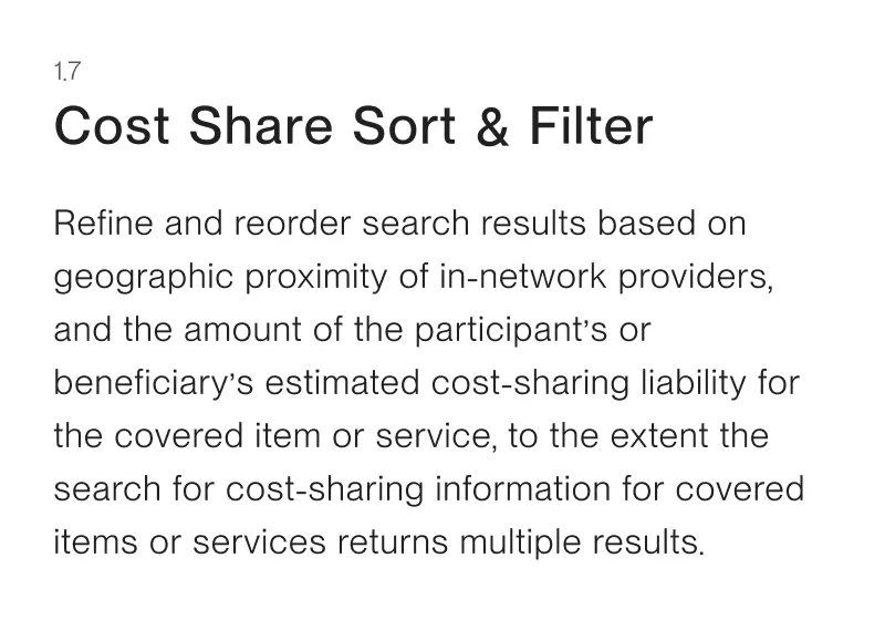
The focus landed on two surfaces: search result pages where users compare providers, and provider profiles where they see detailed cost breakdowns.
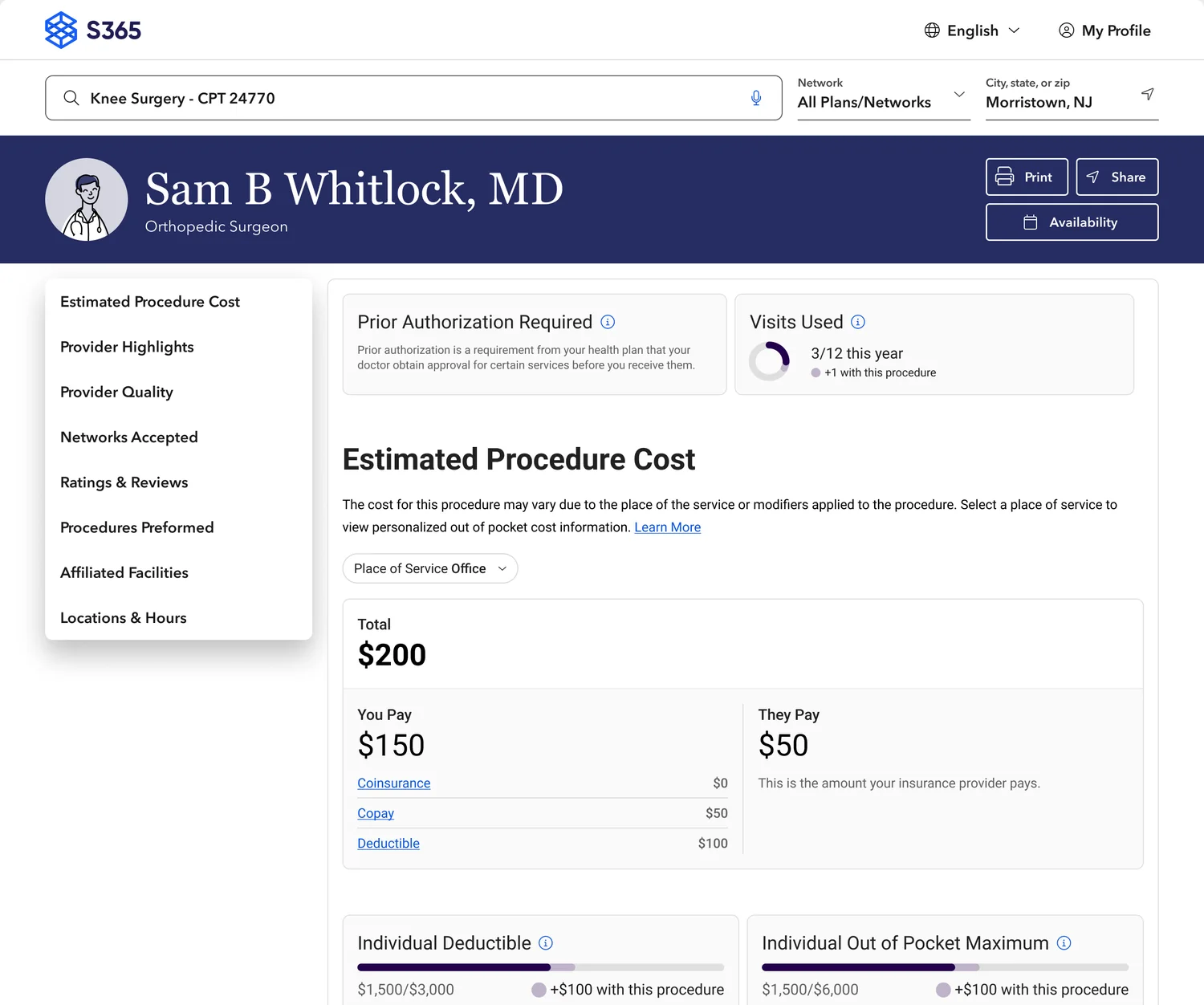
Procedure cost card
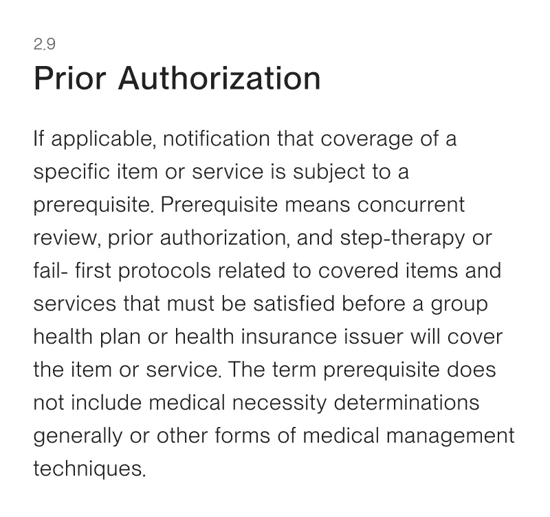
The cost card sits on a provider's profile, breaking down benefit information into a procedure cost estimate — the hardest design problem on the project. I ran iterative usability tests, starting from the original card, to make the information more digestible, applying what the research taught us about healthcare literacy.
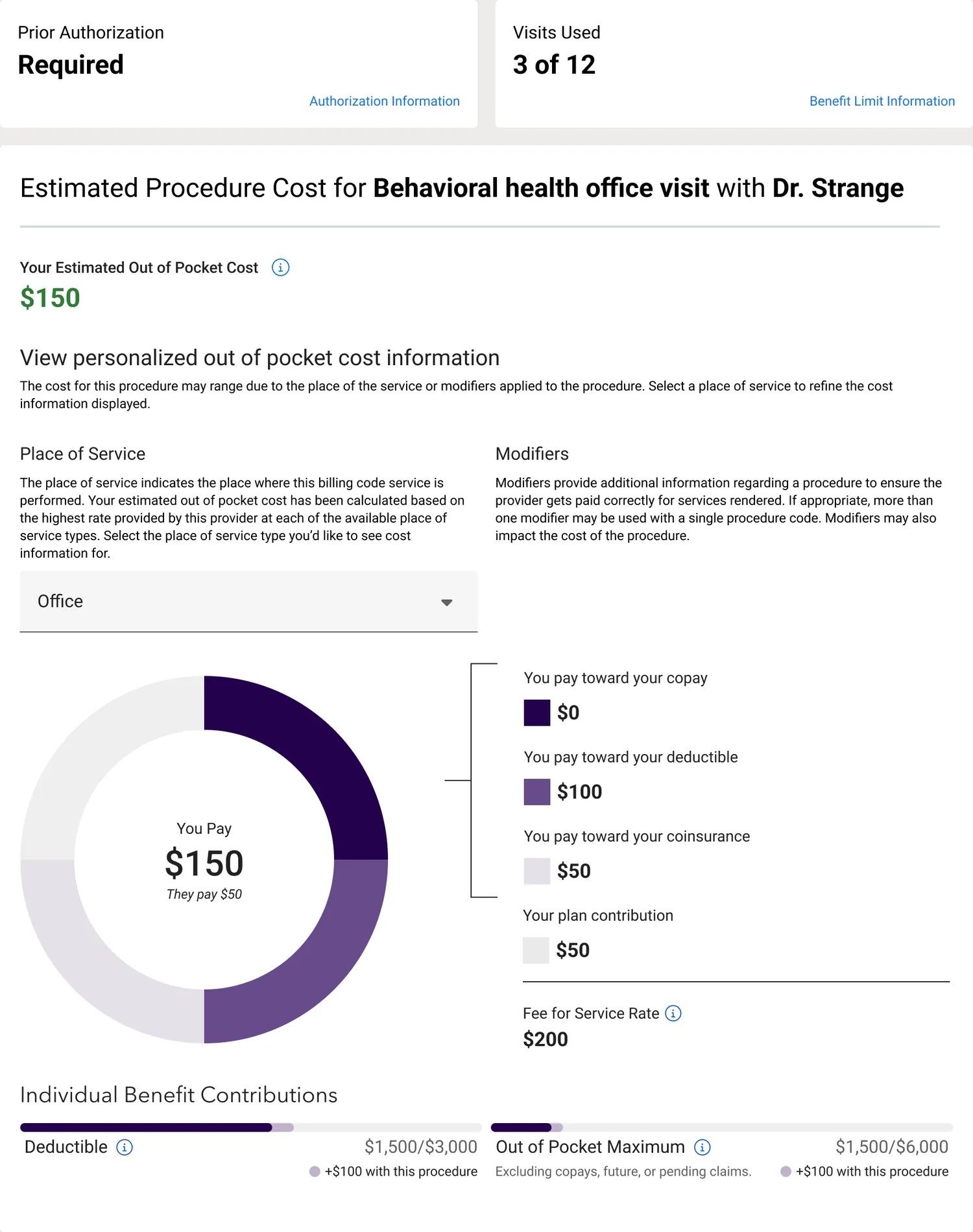
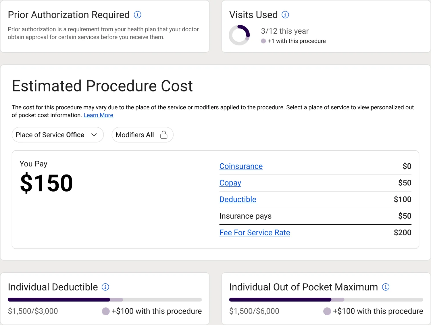
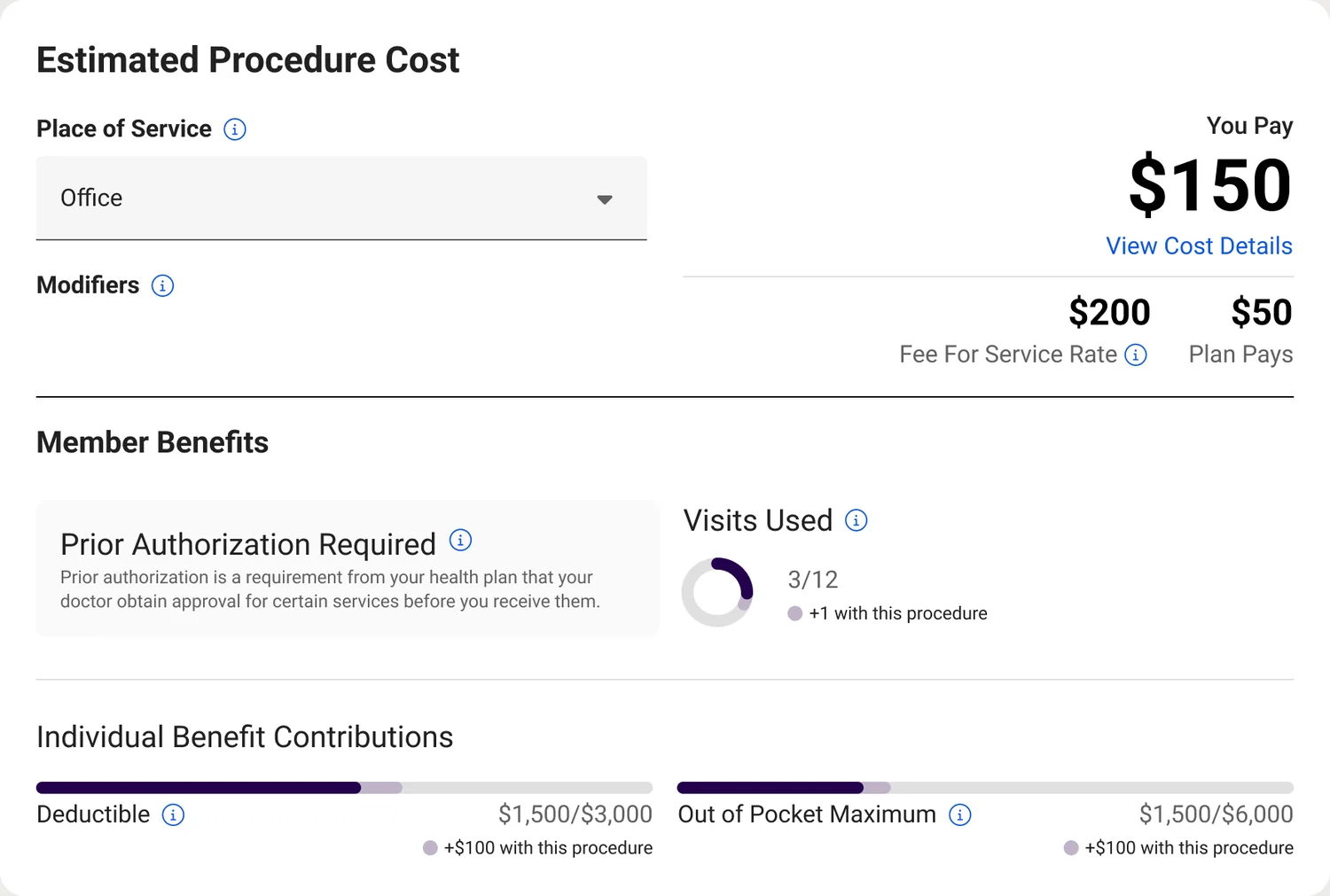
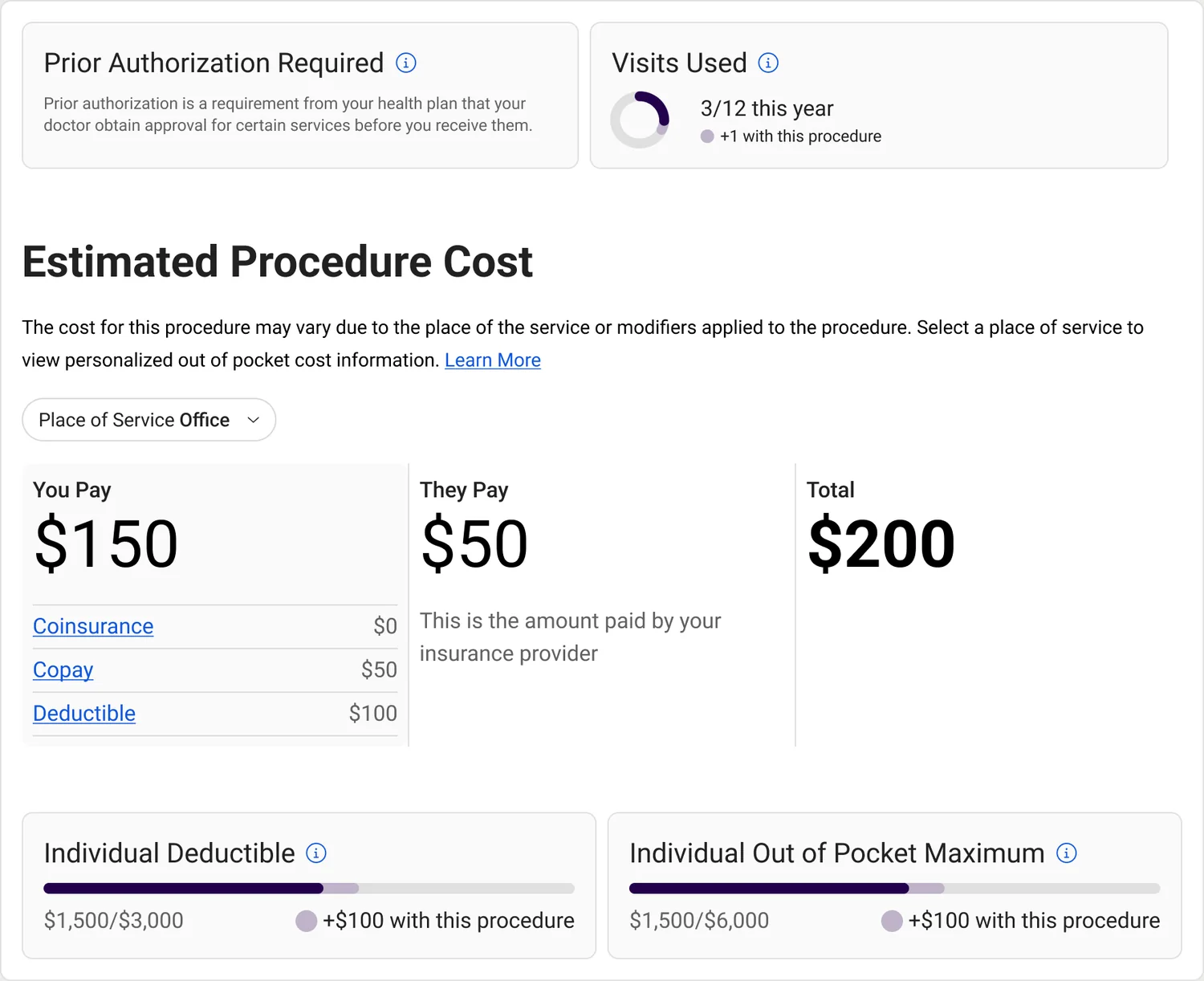
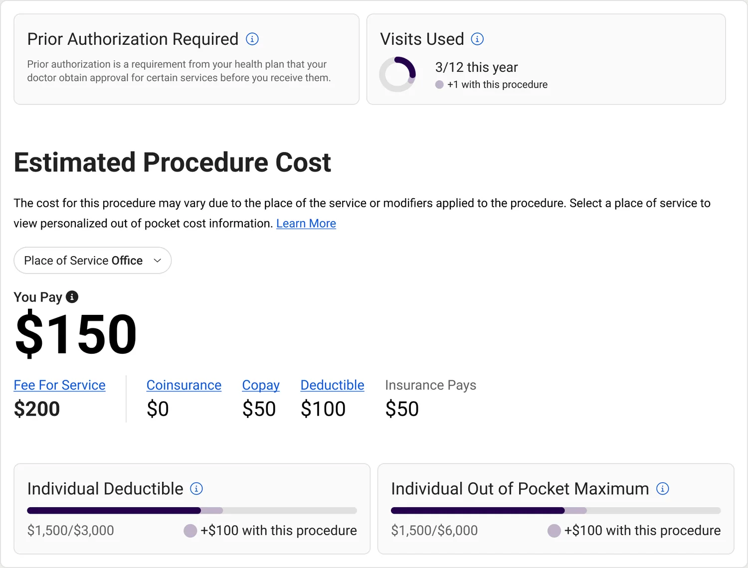
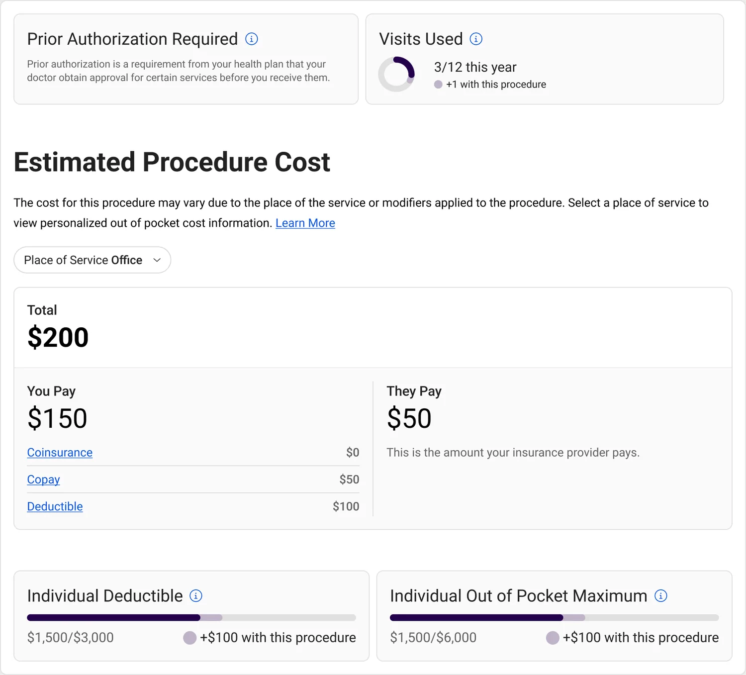
Updated cost card
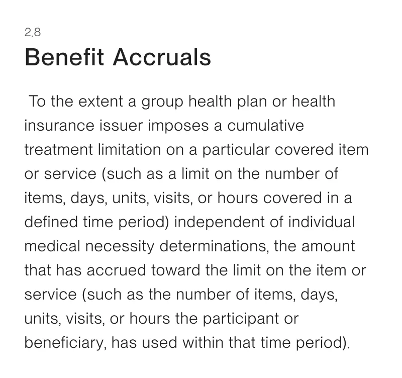
The final design highlights key information while still offering granular breakdowns. I grouped content into three layers — procedure coverage, procedure cost, and benefit accruals — to tell a complete cost story.
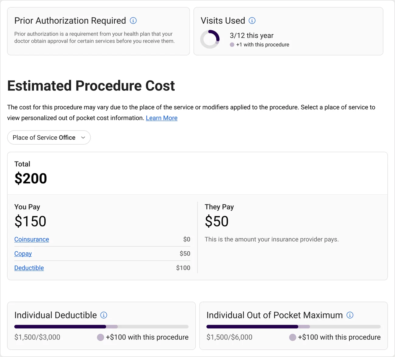
Rate Analytics
Patients pay more than they should because medical pricing isn't competitive — opaque pricing, market consolidation, and negotiation power imbalances all favor insurers over the people paying the bills. Rate Analytics is the module I designed to shift that leverage, built into Network360, an existing tool for health plan administrators to manage their provider networks.
Speaking directly with plan administrators, I mapped how they navigate rate negotiations to inform the granularity of analysis parameters. Geographic segmentation surfaces the strength of a provider network and where competitor populations are being served.

Compliance
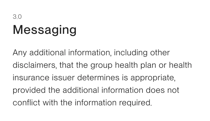
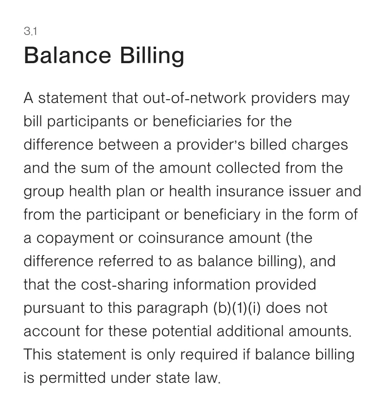
All solutions were documented against 30 UI requirements and signed off by the legal teams of each health plan partner.
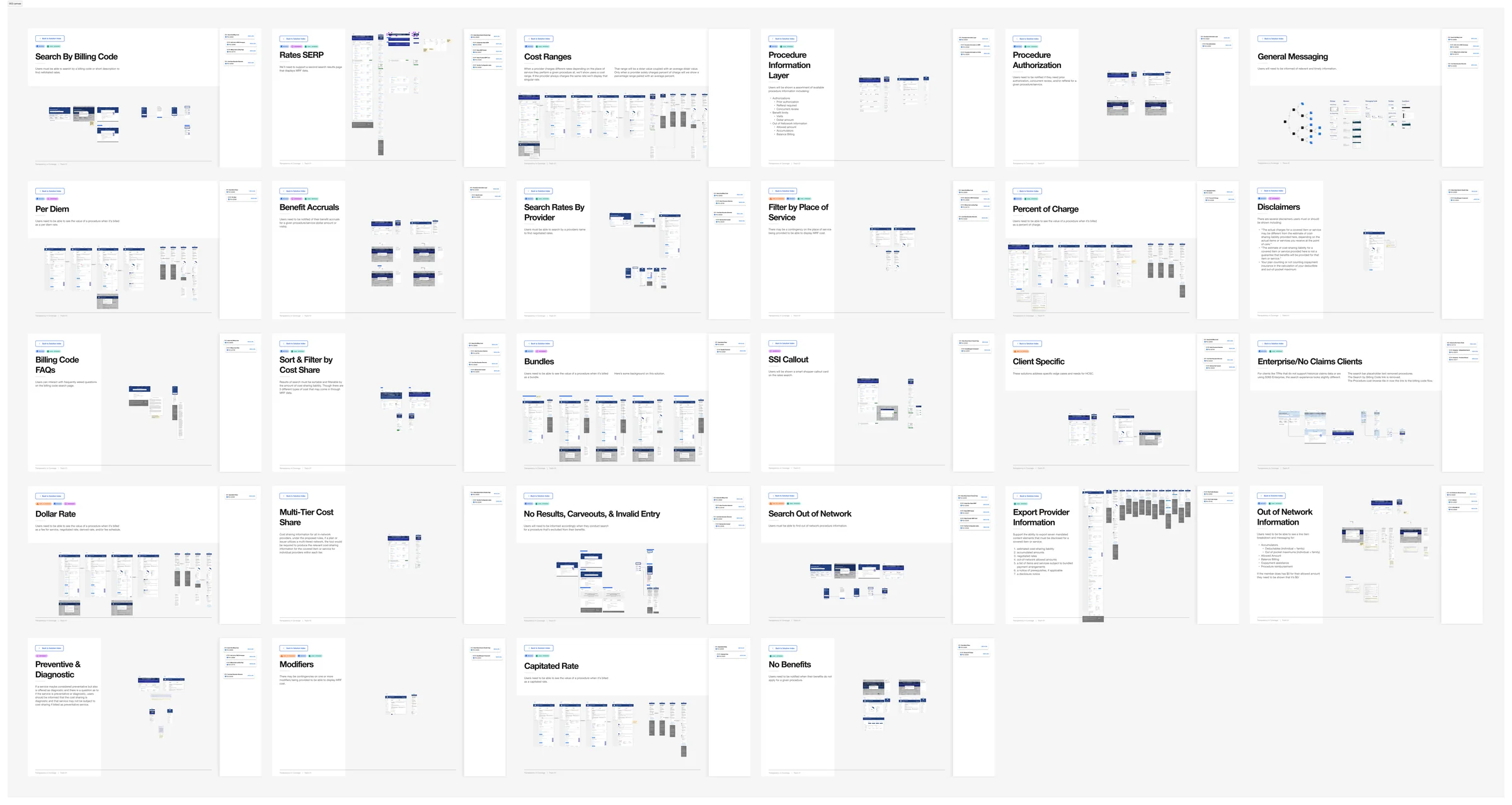
Zoom and pan
Outcome
The tool was white-labeled across 400+ health plan implementations, each with unique branding and data configurations — serving millions of patients annually. This was the first compliant product solution for health plans nationwide, work that led directly to Zelis's strategic acquisition of the Sapphire business, expanding into previously underserved markets.
Reflection
The hardest part of this project wasn't the design — it was the data. Medical rate data is unstandardized, infrequently updated, and often inaccurate. Until the Transparency in Coverage law is properly enforced, the data quality will continue to limit what any tool can do. Designing around that uncertainty — building a product that's useful even when the data isn't perfect — shaped how I think about every complex system I've worked on since.